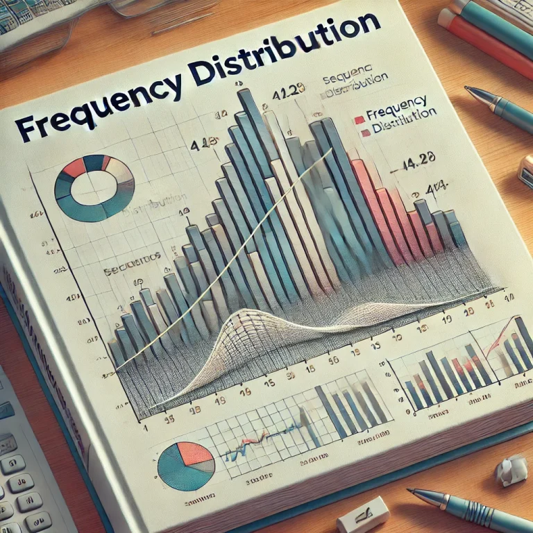
Frequency distribution is a statistical tool in the process of organizing data into categories or intervals. It allows one to see the frequency or the number of times different values appear in a dataset. Its use is a way of visualizing the distribution of how data points spread over various ranges. Frequency distribution works with small or large data sets, and therefore, offers an understandable and systematic method of analyzing data. It is, therefore, required in business analytics research and even academic study.
By this article, we will learn the distribution of frequency. First and foremost, what is frequency distribution? Types of frequency distribution Formula Graphical representation How to prepare a frequency distribution table?
What is Frequency Distribution?
A frequency distribution is a summary of how many times each value, or group of values, appears in a dataset. By sorting data into intervals or categories, frequency distribution allows us to understand the patterns or trends within that particular dataset. This method of arranging data can be very useful when handling big datasets because it breaks complicated data into easily processable information.
Example: Collect scores of 100 students for a test. Instead of trying to analyze every single score, we can use the data to organize the scores into ranges and count how many students scored within each range, for example, the range from 0-10 or 11-20, and so on.
Types of Frequency Distribution
Before going on to how to construct a frequency distribution table, it would be useful to understand some of the different kinds of frequency distributions. These can be broadly classified into:
1. Ungrouped Frequency Distribution
In an ungrouped frequency distribution, each distinct data point is counted individually. This is ideal when the data set contains only a few unique values.
Example:
- Test scores: 10, 15, 20, 25, 10, 20, 30
- Frequency: 2 students scored 10, 1 scored 15, 2 scored 20, and so on.
2. Grouped Frequency Distribution
In this type, data is placed under intervals. This interprets large data sets more easily. Grouped frequency distribution is particularly useful when one deals with continuous data or a large range of values.
Example:
- Test scores are grouped into intervals: 0-10, 11-20, 21-30, etc.
- Frequency: 5 students scored between 0-10, 8 scored between 11-20, and so on.
3. Cumulative Frequency Distribution
Cumulative frequency distribution adds up the frequencies as you move from one interval to the next, showing how many data points fall below a particular value or range.
Example:
- If 10 students scored between 0-10 and 15 scored between 11-20, the cumulative frequency for the interval 11-20 would be 25 (10 + 15).
Frequency Distribution Formula
The frequency distribution formula is easy to express, but the calculation procedure varies with the data as well as the nature of the dataset being used. That is, it differs according to whether you’re dealing with grouped or ungrouped data.
For grouped frequency distribution, the steps are as follows:
- Choose an appropriate number of intervals (also known as classes).
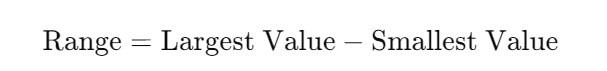
- Calculate the range by subtracting the smallest value in the dataset from the largest value.
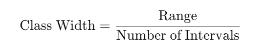
3. Determine the class width using the formula:
4. List out the intervals and count how many data points fall into each class.
Frequency Distribution Graphs
Graphs are a powerful way to represent frequency distribution visually. Common graphical representations include:
1. Histogram: It is an equivalent of the bar graph that presents the frequency of the information found within equal sizes. In this case, the x-axis gives the size of the interval, while the y-axis represents the frequency of occurrence.
2. Frequency Polygon: A frequency polygon is the connection of the midpoints of the intervals on a frequency distribution with straight lines. This is very useful for the comparison of sets of data.
3. Pie Chart: While not as commonly used for frequency distribution, pie charts may provide relative frequencies through percentages of categories in a data set.
How to Make a Frequency Distribution Table
Creating a frequency distribution table involves several steps:
- List the Data: Arrange your data in ascending order or descending order. It will enable you to determine the range and appropriate intervals.
- Determine the Number of Intervals: Decide how many intervals, or classes, as it is called, you wish to have. The size of the intervals will depend on the size of the range of your data set and how detailed you want the distribution to be.
- Calculate Class Width: From the formula above, just divide the range of the data by the number of classes calculated to obtain class width.
- Set the Intervals: Start with the lowest and create your intervals. Make sure that your class size always remains the same.
- Count the Frequencies: Take a walk through your dataset and count how many data points fall under each of the interval classes you made.
- Create the Table: Set up your periods and their corresponding frequencies in a table.
Example:
| Interval | Frequency |
|---|---|
| 0-10 | 5 |
| 11-20 | 10 |
| 21-30 | 8 |
Simple application in statistics: from an overwhelming sea of numbers to a fine structure of counts in ordered intervals that exhibit patterns and trends. Frequency distribution of values together with the construction of frequency tables, histograms, and polygons will make much of the data manageable and visually interpretable. Whether one works in the scholarly arena, or business, or is in any way preparing for tests, the development of frequency distribution will arm the individual with the manipulation of data analysis.
Frequency Distribution FAQs
What is the purpose of frequency distribution?
Frequency distribution helps in organizing large datasets into intervals, making it easier to observe patterns, trends, and distributions of values.
How do you calculate class width in a frequency distribution?
The class width is calculated by dividing the range of the dataset by the number of intervals.
Formula: Class Width= Range/ Number of Intervals
What is the difference between grouped and ungrouped frequency distribution?
Grouped frequency distribution organizes data into intervals, while ungrouped deals with individual values.
What is cumulative frequency?
Cumulative frequency adds the frequencies of previous intervals to the current one, showing how many data points fall below a certain range.
How do you create a frequency distribution graph?
Common graphs include histograms and frequency polygons, which visually represent the frequency of data across intervals.