
Definitive aspects of tabulation help it ensure that its transformed text is readable and comprehensible to an apposite extent. Effective tabulation is characterized by some principles guaranteeing that the presentation conforms to the just interpretation of the response. In effect, these characteristics make tabulation a credible information interpretation tool.
With clear readability and easy understanding, the table design should be kept simple for readers with no knowledge of technicalities. The more simplistic it is, the less likely it will be to obfuscate the entire analysis. Simple tables or designs attain the farthest reach of comprehension.
Accuracy of Information
Accuracy is foundational to tabulating correctly. Each figure, label, and data point must be correct if the conclusion drawn is to hold from that table. Even one mistake in the cell can skew the interpretation of the whole data set. Therefore, thorough checking and validation of tabulated data need to be performed.
Consistency of Format
A uniform format extended across rows and columns gives a visual equilibrium, facilitating readers’ navigation of the table. This applies to fonts, decimal places, units of measurement, and sizes of cells used consistently. This uniform format would avert misinterpretation and provide better grounds to put various comparisons across different parts of data.
Types of Tabulation and Their Use Cases
Several types of tabulation are used to present different forms of data, each with a unique structure and purpose. Understanding these types allows data professionals and students to select the best format for the nature of their data. Each tabulation type brings a different perspective to how data is analyzed and presented.
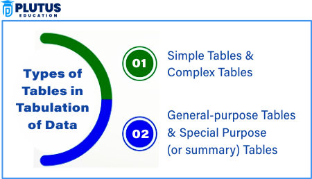
Simple Tabulation
In this case, the data are classified concerning a single characteristic (variable). For example, a simple table shows the number of students in various departments. It is easy to construct and interpret and is used for the most elementary frequency distributions or descriptive statistics.
Complex Tabulation (Two-Way or Multi-Way Tabulation)
Complex tabulation involves two or more characteristics of data being presented simultaneously. For instance, a table showing student distribution based on gender and department is an example of complex tabulation. This type is beneficial when multiple variables interact and require cross-comparison.
Cross Tabulation
Cross-tabulation is used to examine the relationships between two or more variables. It is common in survey research to compare demographic variables with behavioral outcomes, like age vs. brand preference. These tables often reveal patterns and correlations not visible in simple tabulations.
Dichotomous Tabulation
This tabulation is used when data involves only two categories: yes/no responses or male/female classification. Though simple, it effectively summarizes binary data and is widely used in the initial data analysis or demographic segmentation stages. In turn, the time series data is made to prepare and not forms for trend analysis on the basis of months or years. The last forms of space tabulation are data concerned with geographical features that are regions, states, or countries. Generally, these are two forms involved in government statistics and market research reports.
Classification and Tabulation of Data
Classification of data is essential before effective tabulation can be made. This comprises the process of obtaining categories or groups of data according to common characteristics. Its necessity is emphasized in that they may themselves have become far too chaotic or unstructured to be put into any meaningful tabulation.
Importance of the Classification
By and large, classification provides compactness to the data and is likely to bring out its specific features. For instance, classification of data into more or less age groups or income levels will go a long way in revealing to one the patterns regarding interaction with each group. Else, tables would be devoid of emphasis and clarity.
Qualitative Classification
The other one in class identification is the one that recognizes the characteristics of data not capable of being captured in measurable numbers: occupation, education, or gender, for example. In this instance, it is commonly applied in social investigations related to segments of the populace drawn by survey.
Quantitative Classification
Quantitative classification deals with measurable variables such as height, weight, income, or age. It is common to divide info into ranges or intervals, such as age 18-25, 26-35, etc., to be analyzed better statistically. Temporal and spatial classification is where data mainly characterizes time, whether after a week, month, or year, to fit trend analysis. Spatial classification categorizes data using geography, such as city, district, or country, and it is among the most commonly used in political or economic reporting.
Steps in Classification and Tabulation
The classification criteria should be defined first, followed by the data. Next, draw a table format, clear headings, and uniform formatting. This is done with the understanding that the classification revolves around making sense since it is concise and easily interpreted.
Step 1: Define the Objective
- Before classifying, determine what you want to understand or analyze.
- Example: Are you studying customer income, product preferences, or regional sales?
Why it matters: A clear objective ensures relevant grouping and avoids data clutter.
Step 2: Examine and Clean the Data
- Identify types of data: quantitative (numerical) or qualitative (descriptive).
- Remove duplicates, irrelevant entries, and anomalies.
Example: If a survey on student age includes impossible values (e.g., age 200), it must be corrected or removed.
Step 3: Choose the Basis of Classification
There are four main bases of classification:
- Qualitative Classification
- Based on attributes like gender, marital status, nationality, etc.
- Categories are non-numeric.
- Example: Male / Female / Others.
- Quantitative Classification
- Based on numerical variables like age, income, marks.
- Often grouped into class intervals (e.g., ₹0–10,000, ₹10,001–20,000).
- Temporal Classification
- Based on time (day, month, year).
- Example: Annual sales from 2020 to 2025.
- Spatial Classification
- Based on geographical area (e.g., city, state, country).
- Example: Revenue by region—North, South, East, West.
Step 4: Decide on Class Intervals (for Quantitative Data)
- Use equal intervals (e.g., ₹0–10k, ₹10k–20k) for clarity.
- Make sure intervals are mutually exclusive (no overlap).
- Avoid too many or too few classes.
Step 5: Assign Data to Classes
- Tally each data point into its relevant class.
- Use frequency distribution tables to count how many values fall into each class.
Example:
Marks: 30, 40, 60, 65, 70
Class 60–69 will include 60 and 65, but not 70 (if using inclusive classification).
Tabulation FAQs
Q1. What is tabulation in statistics?
Tabulation emphasizes organizing data in rows and columns for systematic reading and analysis.
Q2. What is the main purpose of tabulation?
It aims to make large data sets for ready comparison, analysis, and decision-making.
Q3. How does classification aid in tabulation?
Classification organizes raw data into groups, which makes it ready for tabulation in a structured format.
Q4. What are the types of tabulation in statistics?
Types include simple, complex, cross, dichotomous, temporal, and spatial tabulation.
Q5. Why is accuracy important in tabulated data?
Accurate tabulation will translate into valid insight and save the analysis from engaging in misleading conclusions.